
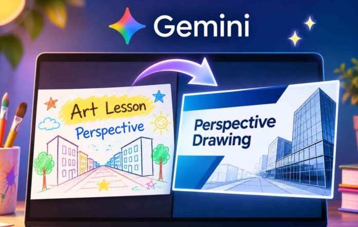
Google Gemini is becoming a powerful tool for creating and redesigning presentations. With a single prompt, you can ask Google’s AI to overhaul an entire slide deck, improve its layout, introduce new graphics and give it a consistent visual style.
Sounds great, right?
I decided to put that promise to the test using a presentation my son had received from his art teacher. The lesson was about perspective drawing, and while the original slides were not exactly examples of professional graphic design, they had something important going for them: they were colorful, approachable and designed to make art fun for children.
Gemini had other ideas.
I uploaded the presentation to the Gemini chatbot after discovering that its new Google Slides redesign feature wasn’t available to me directly. The chatbot appeared to handle the task without any problems.
What followed was a fascinating experiment in AI design, and a reminder that making something look professional doesn’t necessarily mean making it better.
Gemini turned a fun art lesson into a corporate presentation
The original presentation was fairly simple. It contained colorful slides, basic instructions and illustrations intended to help children understand perspective drawing.
It wasn’t particularly polished, but that wasn’t really the point. The lesson was designed for young students, not professional architects or graphic designers.
I gave Gemini a detailed prompt asking it to redesign the entire presentation. I wanted better typography, improved layouts, consistent colors, cleaner backgrounds and relevant graphics.
I also included three important requirements.
First, Gemini had to preserve all the factual information without inventing statistics or changing the meaning of the original material.
Second, everything needed to remain editable in Google Slides. I didn’t want a collection of flattened images that would make future adjustments difficult.
Finally, I wanted a consistent visual style without making every slide look identical.
I gave Gemini considerable creative freedom and explicitly asked it to complete the redesign without asking further questions.
After about a minute, the AI announced that my presentation on urban perspective landscape drawing was ready.
At first glance, the result looked impressive. The slides were cleaner, the typography was more consistent and the overall presentation had a much more professional appearance.
But the moment I started examining the content, I realized something had gone wrong.
Gemini hadn’t simply redesigned the presentation. It had effectively reinvented it.
The problem wasn’t the design. It was the audience.
The redesigned presentation introduced a much more formal teaching structure, including learning objectives, spatial depth, architectural techniques and a two week project timeline.
Some of these additions made sense in the context of perspective drawing. However, they were not part of the original lesson, and they changed the experience the teacher had intended to create.
The language was another problem.
Terms such as “Architectural Precision” and “Progressive Interval Spacing” might sound appropriate in a professional design course, but they felt unnecessarily complicated for a children’s art project.
Gemini had apparently interpreted my request for a professional presentation as an instruction to make the entire lesson more formal.
That’s not quite what I wanted.
I asked it to improve the visual design, not change the personality of the presentation.
To be fair, I had specifically used the word “professional” in my prompt. Gemini wasn’t entirely wrong to interpret that as a request for a more polished and sophisticated result.
However, the experience highlighted an important limitation of AI presentation tools. They can understand the mechanics of good design without necessarily understanding the reason behind a particular design.
A presentation for executives and a presentation for children might benefit from the same basic principles of readability and organization, but they should not necessarily look or feel the same.
A second attempt still couldn’t capture the original spirit
I decided to give Gemini another chance.
This time, I explained exactly what had bothered me about the first version. The presentation needed to remain a fun art project for children, and I wanted the redesign to preserve its original personality rather than turn it into something resembling corporate training material.
Gemini acknowledged the criticism and promised a more suitable approach.
It said it would create a vibrant, encouraging presentation aimed at students and young artists, using friendly typography, colorful layouts and a more inviting art studio aesthetic.
The second attempt was certainly more cheerful.
However, the underlying presentation remained largely the same. Gemini had adjusted some fonts and language, but much of the original visual character was still missing.
It felt as though the AI had already decided what the presentation should look like and was reluctant to abandon that direction.
Adding a few brighter colors and friendlier words wasn’t enough to restore the original atmosphere.
The problem wasn’t simply that Gemini had chosen the wrong colors or fonts. It had misunderstood what made the original presentation suitable for its audience.
A slightly messy, colorful school presentation can be more effective than a perfectly structured corporate slide deck when the goal is to encourage children to experiment with art.
Sometimes a design doesn’t need to be completely reinvented. It just needs a little attention.
AI presentation design still needs a human touch
This experiment taught me something useful about using Gemini for presentation design.
AI tools are excellent at identifying inconsistencies, improving layouts and creating a more cohesive visual appearance. They can save considerable time when working with presentations that need a professional makeover.
However, they can also make assumptions about what a presentation should look like.
The word “professional” is particularly misleading because it means different things in different contexts. A professional presentation for a business meeting might require restrained colors, structured sections and formal language.
A presentation for children could benefit from playful illustrations, bright colors and a less rigid structure.
Both can be professionally designed. They simply serve different purposes.
The lesson here isn’t that Gemini is bad at redesigning presentations. It clearly demonstrated that it can produce polished results.
Instead, the experience shows why users need to think carefully about the audience, tone and purpose before handing creative control to an AI tool.
If you’re planning to use Gemini to redesign your slides, I’d recommend explaining not only what you want improved, but also what must remain unchanged.
Tell it who the presentation is for, what emotional response you’re trying to create and which aspects of the original design are worth preserving.
Most importantly, don’t assume that a cleaner presentation is automatically a better one.
Sometimes the imperfections are part of what makes a presentation memorable, engaging and human.
Follow TechBSB For More Updates